
The startup client I was working for- Upgrademe, was launching a new web app for their educational online resource. I was specifically working on the front-end development of the web app.
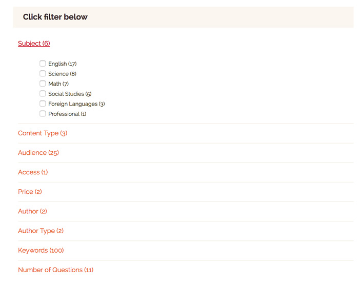
Setting up the secondary navigation menu for the web app posed some challenges for the development team. Since the majority of their audience was school/college kids, it was vital to have the navigation touch-friendly, so that it functions well on tablets, iPads, and other touch-sensitive devices.
The key considerations when developing a touch-friendly and responsive navigation menu were:
- Get the navigation menu to respond to tapping versus hovering.
- Make the navigation usable on small screen space.


Notes:
- Using jQuery and CSS, I build an open/close navigation menu.
- Using media queries the navigation was made responsive.
- Instead of using the hover on-off states to display the open/close navigation, using the jQuery events – mousedown and touchstart, to open and close the drop-down menu.
The jQuery code snippet
$(".facetParent > a").on("mousedown touchstart", function(e){
if(!$(this).hasClass("active")) {
// hide any open menus and remove all other classes
e.preventDefault();
$(".facetParent div").slideUp(300);
$(".facetParent a").removeClass("active");


// open our new menu and add the open class
$(this).next("div").slideDown(300);
$(this).addClass("active");
}
else if($(this).hasClass("active")) {
$(this).removeClass("active");
$(this).next("div").slideUp(300);
}
});